Embarking on a website project can seem like a daunting task. They’re constantly changing, expensive, and are saddled with the huge obligation of recruiting students to your institution. While many community colleges might feel they need a facelift, getting started is always the hardest part. From continuing education, workplace development, and other non-traditional student pools, it’s difficult to know which to tackle first, and how to get everything across in a clear, succinct way.
We’ve put together a list of 5 of the best community college websites to start you off. From UX/UI, event accessibility, and content structure, here’s what some of the best websites in the space are doing.
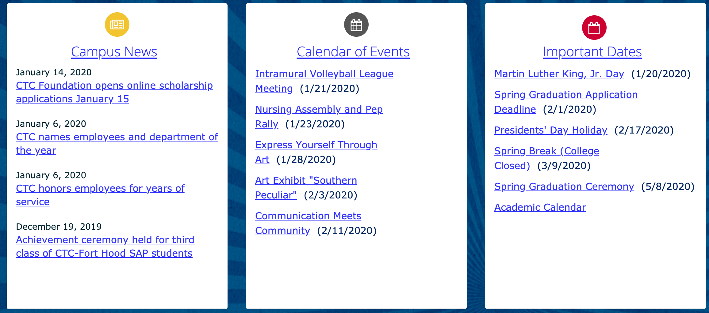
- Central Texas College: The most important thing a college website can do is present information clearly, and in an easy to find way. Central Texas College makes it simple to view upcoming events, news, and student information right from the home page, and drives visitors further into the site in a linear manner, without leaving prospective students to do guess work. In the example below, current and future students are able to see campus news, upcoming events, and important dates at a glance, just by scrolling. Additionally, Central Texas College lays out their content in a way that is simple and easy to navigate from the top down. Their navigation menus are informative without being overwhelming, and walk prospective students through everything they could need in their search.

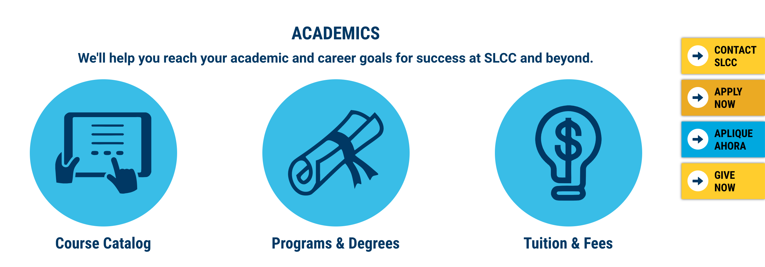
- Salt Lake Community College: Salt Lake Community College keeps things simple in the best way. They tell their story succinctly, while keeping tools for students front and center all the way through the site. Right up front are links to important things like News & Events and Maps, as well as My SLCC for current students. Most importantly, students are followed by a sticky bar prompting them to take an action: Apply, Contact, and Give, the three primary calls to action on the site. This means that visitors never have to go looking or wonder who to reach out to with questions. This feature also has the added benefit of appearing reliably without popping up again and again on every page, making for a smooth experience. Finally, the site keeps everything flowing consistently. The colors remain uniform, and additional information is outlined in an easily digestible grid format, letting visitors guide their own path through the site.

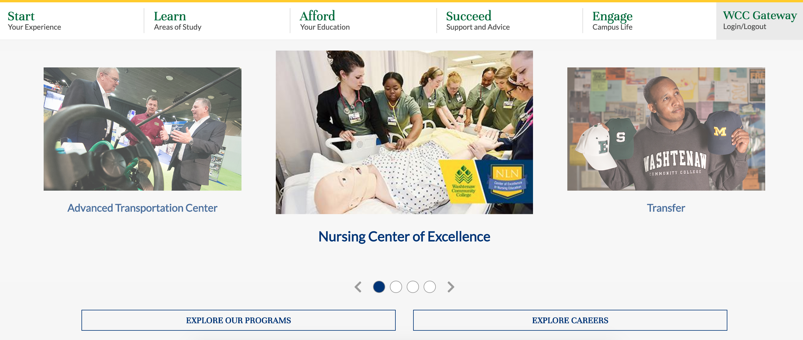
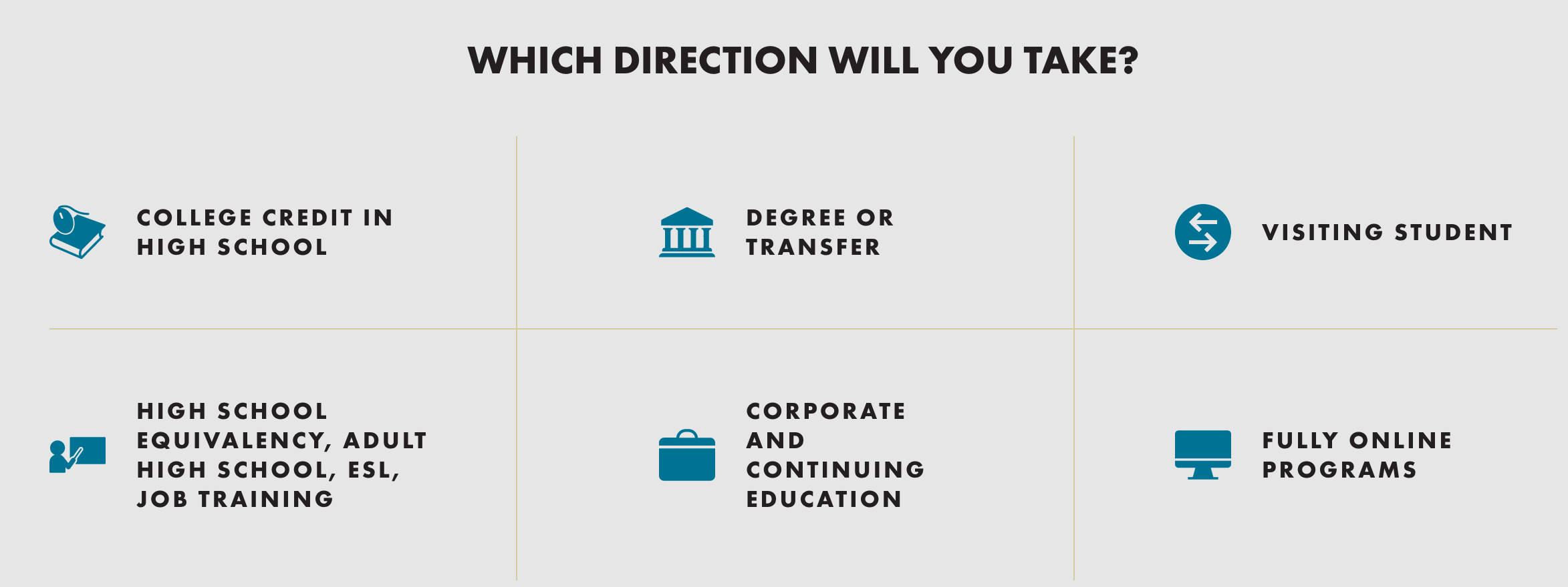
- Washtenaw Community College: Washtenaw Community College has a lot to offer students, and uses every piece of their site to tell a compelling story. They embrace all areas of education, from GEDs to continuing education and transfers, and make sure prospective students know their options when they come to the site. Their sticky navigation menu allows visitors to scroll and explore freely, while keeping the option for more information readily available. Washtenaw Community College layers story with promise and value, creating a powerful experience all the way through.

- Community College of Rhode Island: The Community College of Rhode Island maximizes their use of space. From the navigation menus to the individual pages, they share their value wherever they can. In the below example, they treat the menu as a blurb of their About page, rather than just for navigation. This gives visitors a glimpse of their story, front and center. Additionally, they use the homepage to highlight student stories, financial aid and information, and easy links to campus events.

- Central Piedmont Community College: Central Piedmont Community College inspires their future students. Their mission is to facilitate not just learning, but successful learning through to completion, and that message is felt on every page of the site. They list options for all learners wherever they can, and they embrace ongoing, lifelong learning. Additionally, they make the most of their About Us page. This is something that is often overlooked, but CPCC uses theirs to drive their mission home, treating it as an additional place to inspire prospective students to join them on campus.

Ready to take your website to the next level? Find out how a CRM can transform the student experience on your campus, on and offline!

