We’re all aware of the increased competition to attract and engage students in higher education today. Luckily, there are ways for schools to break through the noise and meet the evolving needs of students. The institutions that are making conscious efforts to refocus their recruitment strategies by creating a seamless, cross-platform experience for students are cutting through the clutter and seeing real results.
Instead of simply meeting students where they are, craft your institution’s digital experience in anticipation of where students will be for an absolute advantage. We all know how attached Millennials and Gen Z are to their smartphones, so digital marketing and mobile-first websites are no longer optional for recruiting these target student populations. But, how do we take this a step further?
For starters, consider the way your digital efforts are positioned and fine tune strategies from there. Are your website and application built mobile-first to attract today’s digital-native students? Do you have a content marketing strategy in place to address the needs of students at different stages of the admissions funnel? Are you leveraging the latest and greatest supporting technologies like live chat widgets and university-sponsored mobile communities to improve enrollment? Keep reading for our top tips on how to create a more seamless student experience — from the first interaction, through enrollment, and beyond.
Making A Strong First Impression
The student experience doesn’t start when a student arrives on campus; it starts the moment they first interact with you. And whether that experience starts on your website, social channels, or offline, that first interaction sets the tone for your relationship moving forward.
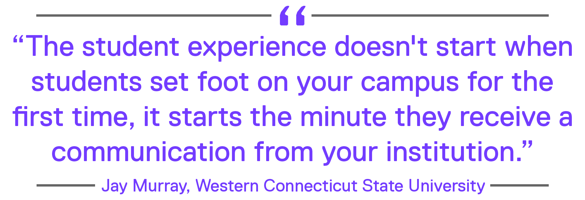
“The student experience doesn’t start when students set foot on your campus for the first time, it starts the minute they receive a communication from your institution. Too often, we forget that the digital experience is just as important to students as their physical experience,” says Jay Murray, AVP for Enrollment Services at Western Connecticut State University.
More than ever before, that initial experience is on a mobile device, and it’s likely to involve your website. Prospective students and their parents identify your website as one of the most influential touchpoints during their college search, and today, 8 in 10 of those students are visiting a college website from their mobile device. If that experience is frustrating due to poorly organized content, unclear messaging, outdated information, or boring stock photos, you risk losing that contact forever.
In fact, 1 in 10 high school seniors and their parents claim to eliminate a college or university from their list of potential schools due to a poor website experience. When you consider that 76% of students indicate that their mobile experience is merely “ok,” or worse, “challenging,” it doesn’t take an advanced degree to see that this is a dangerous situation.
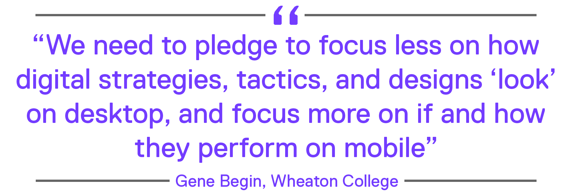
As students increasingly turn to mobile devices, your website needs to move from mobile-friendly to mobile-first, and that doesn’t mean scaling your website to fit mobile screens. “As marketers and communicators, we need to pledge to focus less on how digital strategies, tactics, and designs ‘look’ on desktop, and focus more on if and how they perform on mobile,” says Gene Begin, VP of Marketing & Communications at Wheaton College. That means your web pages must load quickly, your visuals should make an immediate impression, and your body copy needs to utilize proper heading structure and be easily scannable.

And that doesn’t just apply to your homepage and key dashboard pages. As search algorithms continue to improve, every page on your website has the opportunity to serve as an entry point. That includes academic program pages, admissions requirement pages, or individual news articles or blog posts.
Nurturing Prospective Students Through The Applicant Journey
When you consider a prospective student’s first interaction with your institution, it’s important to consider that it’s not uncommon for that interaction to take place several months, or even years, before that prospective student applies to your school, if they apply at all.
Choosing a college or university is an emotional decision. It takes an incredible amount of research, consideration, and comparison for students to choose their desired schools and programs. Back in 2011, a study by Google found that the average consumer researched nearly 11 different sources before making a purchasing decision. That statistic was for consumer purchases over seven years ago. How many sources do you think students are using to pick a college today? 20? 30? 50+?

As students research your institution, its culture, and its programs, their questions, pain points, and content needs change. Your website needs to change too, with content that meets students where they are in their college search journey. If your website features a single primary call-to-action to “apply” for prospective students, you’re missing out on valuable opportunities to generate leads earlier in the admissions cycle that your recruiters can nurture over time.
This is a problem that Jenny Petty, Director of Enrollment Marketing at the University of Wyoming, understands firsthand. Prior to redesigning the University of Wyoming website, Petty noticed a gap in content offerings for prospective students on the website. “If a prospective student visited our website, their choices were to apply or to continue to poke around,” said Petty. “Our website was proposing on the first date.”
Petty’s solution was to implement marketing automation software and pair it with SEO-optimized blog articles, custom landing pages, and value-based gated content. By doing so, Petty was able to meet students at various stages of their journey.
For students who were just beginning their college search process, Petty drafted educational blog posts about the college search process that were based on popular keywords, increasing Wyoming’s organic search traffic. She then created landing pages with embedded forms that students could fill out to receive helpful admissions content, like an admissions checklist.
Finally, Petty worked with current Wyoming students to craft culturally-focused blog posts that appealed to students who were getting more serious about their research into the University of Wyoming. By appealing to students at each phase of the admissions journey, and nurturing them through the remaining phases of their search, Petty was able to build better student relationships through content. The result: Petty was able to trace 25% of the University of Wyoming’s 2017 freshman entering class back to a landing page created in her new marketing automation software.
Lowering The Barriers To Entry
With increased competition to attract prospects in today’s higher ed landscape, it’s more important than ever before to create a seamless, cross-platform student experience. Once a student has expressed interest in your university, encourage higher conversion rates with robust online applications and student portals that are built mobile-first. If students have to “pinch and zoom” at any point in their digital interactions with your institution, that’s a major obstacle in their way of applying to your school. Last year alone, 76% of students completed some portion of their admissions application on a mobile device and 13% actually completed and submitted their entire application via mobile.
Lower the barriers to entry and get more prospects into your funnel by supporting students with a mobile-conscious recruitment strategy that leverages the right supporting technologies. Have you ever tried completing your school’s online application from your smartphone? Experiment with this on your own and see if you’re able to easily fill out the application, or better yet, complete it from the palm of your hand. Don’t forget to assess the aesthetic appeal of your application on mobile for a glimpse into the student-facing user experience.
Engaging with students pre and post-application submission is key in driving enrollment metrics. It’s no secret that today’s students move on if they don’t find the answers they’re looking for instantly. That’s why the immediacy of live chat features is so successful for higher ed. Make information more accessible to students by involving admissions representatives in the backend of a chat widget on your site to help answer questions quickly and efficiently. Live chat eliminates the frustrations students associate with aimlessly clicking around on your website for answers and promotes a better overall experience.
Another mobile-first student engagement tactic involves the use of a university-sponsored digital community. (And no, we’re not talking about spamming prospective/accepted students with general marketing messages in a Facebook group.) In fact, traditional high school graduate-aged populations are moving further and further away from Facebook altogether- a recent eMarketer report predicts a 5.8% decline in Facebook users between 18 and 24 years old, which amounts to losing roughly two million users. Make sure your office is focusing and investing its marketing resources in platforms that actively address your target student demographics.
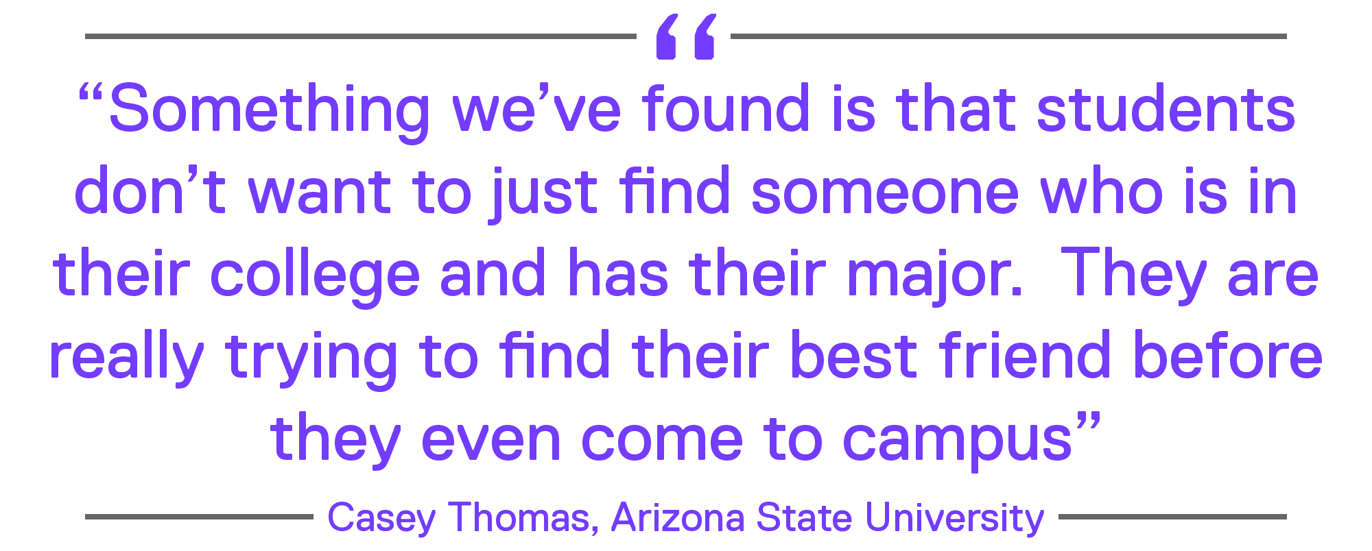
Institutions that facilitate private, digital communities via mobile app are gaining a competitive advantage and seeing increased enrollment conversions as a result. These apps allow students to connect with one another as well as staff, form cohorts based on shared interests, and send messages all in one dedicated place. “Something we’ve found is that students don’t want to just find someone who is in their college and has their major. They want to find someone who is in their college, has their major, is from where they are from, and likes the same music and movies. They are really trying to find their best friend before they even come to campus,” says Casey Thomas, Assistant Director of Digital Engagement at Arizona State University. The more engaged students are with your university, the more likely they are to enroll, and university-sponsored mobile communities are continuing to move the needle – a fact that Matthew Boyce, Director of Enrollment Management at George Mason University can attest to.
“Students who join Schools App are about four times more likely to enroll at George Mason than students who don’t use the application,” says Boyce. “For example, 60% of students from outside of Virginia (who we yield at a much lower rate) who joined Schools App enrolled at Mason. Only 4% of students who didn’t join the app did so. We think that speaks volumes,” says Boyce.
Taking Action
The bottom line is clear: you’re competing with an avalanche of information that is constantly being delivered into the palm of students’ hands. To stand out from the crowd, your website, content, and communications need to be hyper-tailored, relevant, and accessible. Speak to who individual prospects are and strive to solve their unique pain points with a mobile-first recruitment strategy that supports students at each stage of your funnel — from inquiry to application to enrollment.

First impressions matter, so set the tone for your relationship with a student moving forward with a website that loads quickly, includes bold visuals that stand out, and provides meaningful content that is easily scannable. Then, further nurture prospects with SEO-optimized blog articles, custom landing pages, and value-based gated content to improve conversion. Make sure you lower the barriers to entry for students and enhance their overall experience (while improving enrollment metrics!) with the right supporting technologies — mobile-first online applications, intuitive student portals, and university-sponsored mobile app communities can really move the needle on your campus.
However, updating your recruitment approach and improving your digital marketing strategy isn’t enough in today’s competitive higher ed market. Redesigning the student experience requires a paradigm shift among staff that challenges the status quo and prioritizes the student — simply adopting new technologies and implementing innovative tactics will not cut it.
*This post was published in collaboration with Stephen App, Account Director at eCity Interactive. eCity Interactive is an award-winning digital agency that uses proven digital methods to impact the things that matter most to your campus. Every challenge has a solution. eCity can help you find yours.

